Kanguro Counter APP — Scanner
Designing a logistics tool for people who had never touched a computer.



Challenge
Logistics for people who had never touched a computer
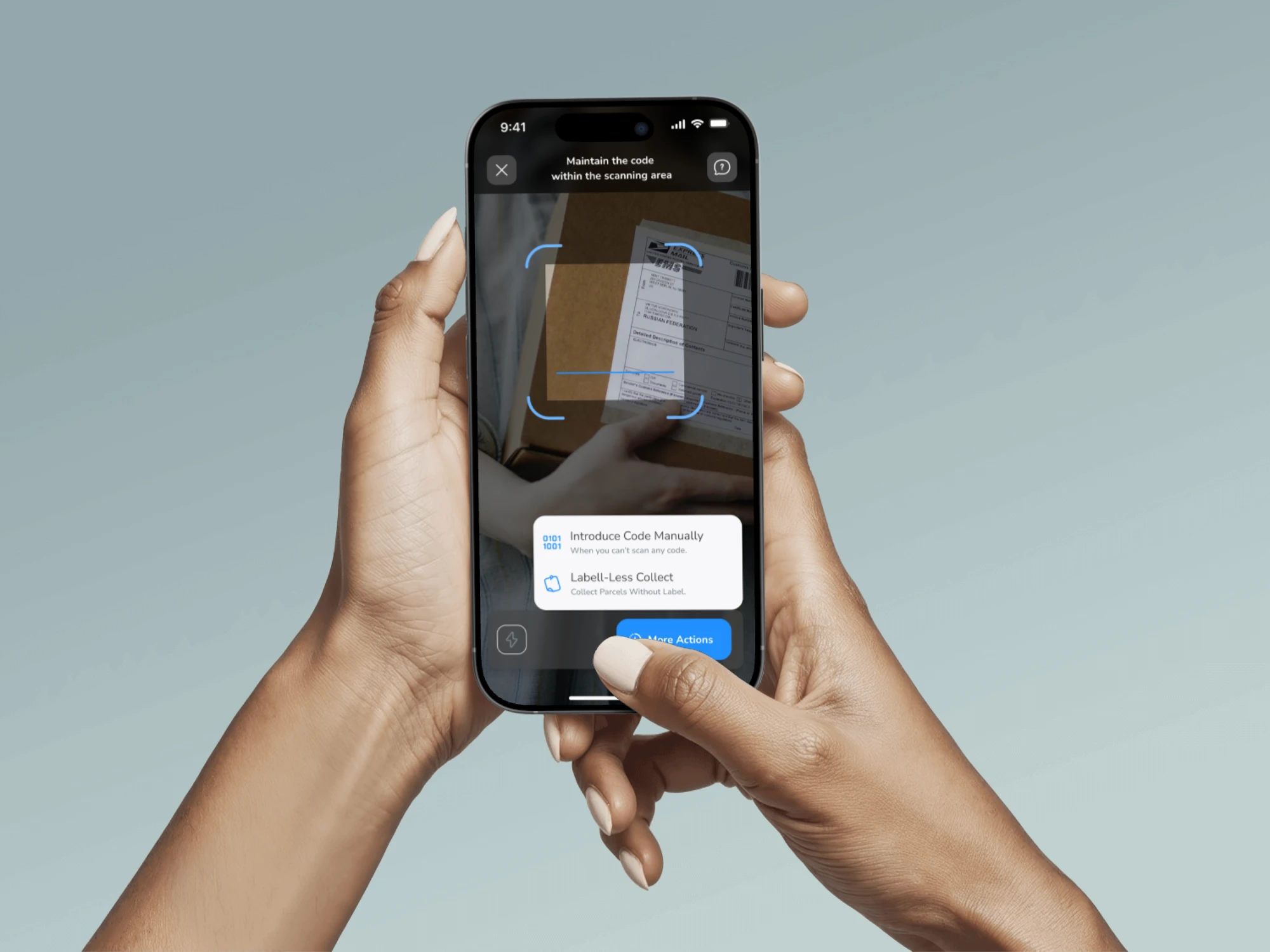
Kanguro connects major carriers — Amazon, UPS, GLS, Ontime, Paack — with a network of local businesses where customers pick up their packages. Someone has to manage those packages at each point, and that someone is the owner of a stationery shop or a hair salon who also has customers to serve, a till to close and a business to run. The product was built entirely in English: the engineering team was distributed across Syria, India and Germany, and English was the only shared language. That is why the screens are in English. There was an app in production. It worked. But the kounters — the staff at each point — were scanning packages without knowing what they were doing.
The challenge wasn't just UI. It was comprehension: making someone with no logistics background execute correctly, without errors, with a customer standing right there.
Research
Before touching Figma, I went to the points
I visited businesses with and without prior logistics experience. The difference was stark: the first group understood the vocabulary; the second needed everything to be self-explanatory. I observed them working and ran two rounds of interviews — one to understand their context, and a second with a first designed version to gather direct feedback on the app.
Field observation
I visited the points without intervening. I observed how kounters processed real packages, where they got stuck, what they ignored, and what they asked their colleagues. No script, no questions — understand first, ask later.
Semi-structured interviews × 2 rounds
Round 1: contextual discovery — what they understood about the logistics process and what they didn't. Round 2: validation with a first designed version. Two different moments in the project, two different objectives.
Jobs to be Done
The framework that organised the insights. The kounter's core job: "When a courier or customer arrives, I want to register the operation quickly and without errors, so I can get back to running my shop without wondering whether I did it right."
The key insight: the problem wasn't lack of skill. It was lack of context. A kounter who's been running their shop for twenty years can learn any process — if that process is explained in their language, not in logistics language.
Exploration
The process started on paper
Before opening Figma, I needed to resolve whether it made sense to unify the different transaction types into a single entry point. The flow sketch was the most important artefact of the project — the decision diamond in the centre and the annotation "combine correct flow" are the exact moment when the app's logic was born. From there I moved directly to high fidelity, documenting each complete flow before designing screen by screen.
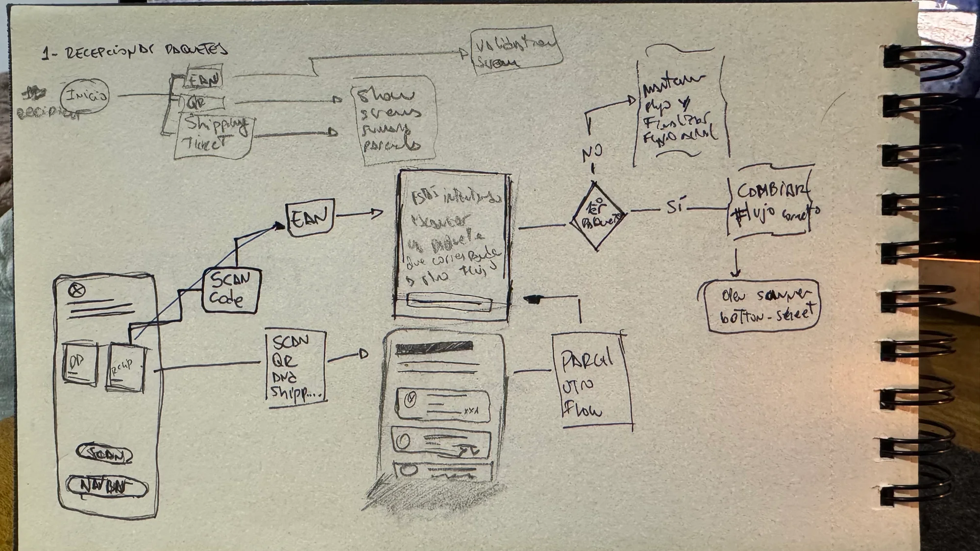
User flows are shown with reduced detail due to a non-disclosure agreement. Full content is available in direct conversation.
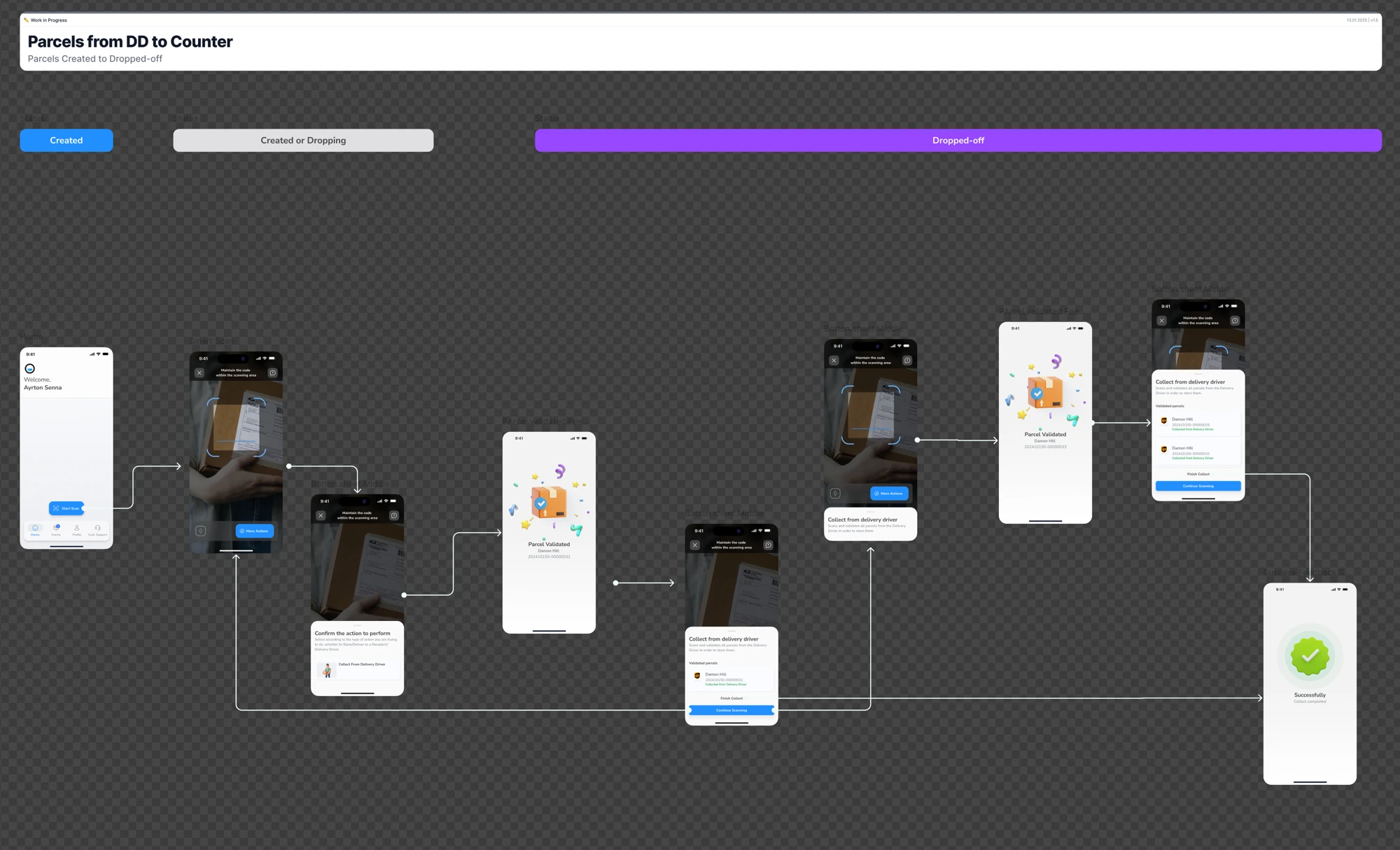
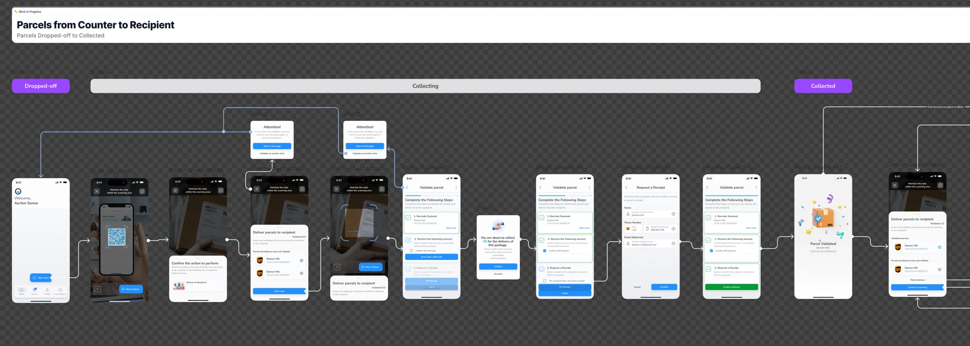
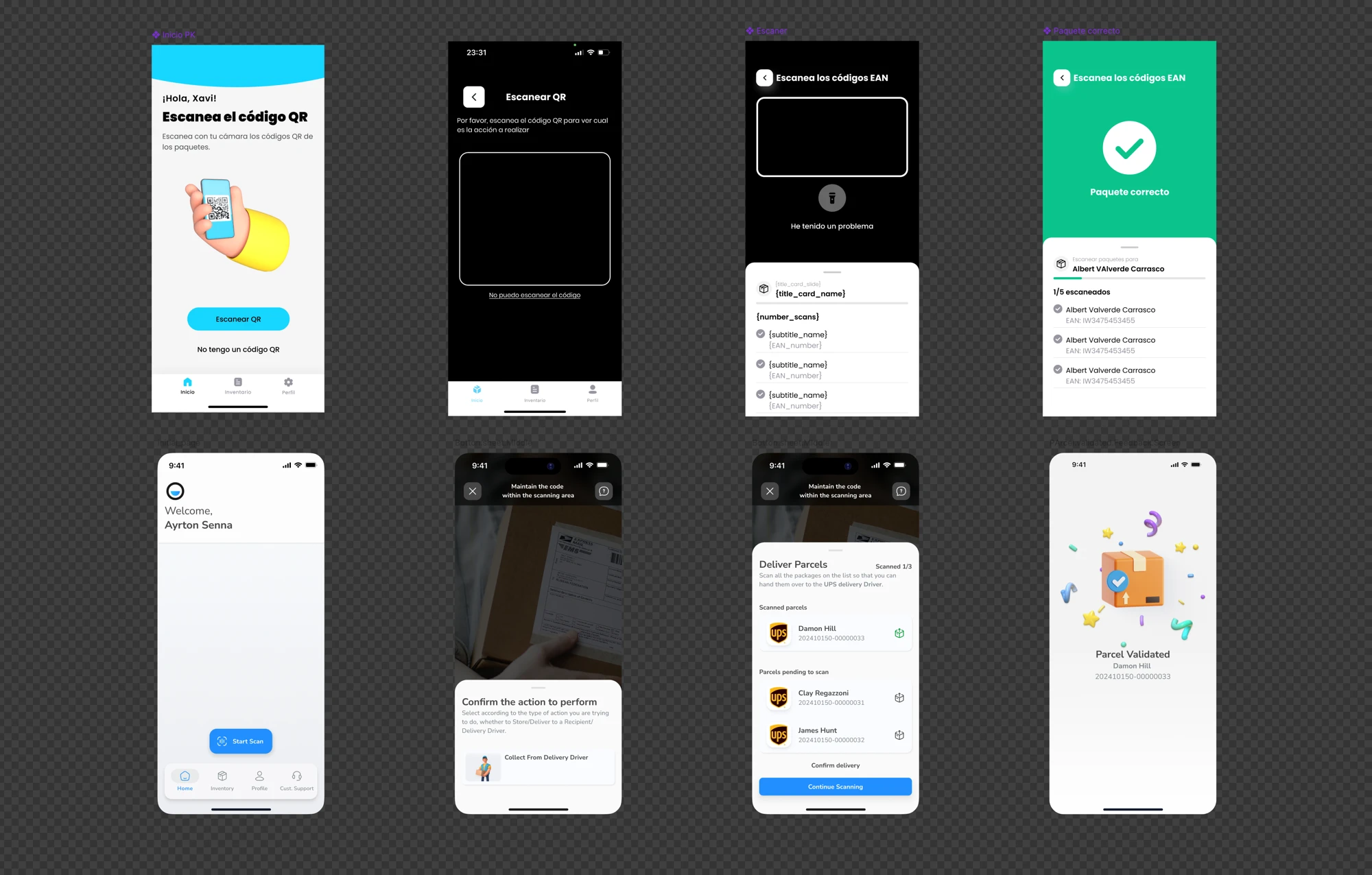
Before · After
The previous version started from an incorrect premise: that the kounter already knew what they were doing when they opened the app. The home asked them to scan with no context. The scanner didn't differentiate between receiving and delivering. The visual system — intense yellow, cyan, decorative 3D illustrations — prioritised visual energy over operational clarity.
The redesign starts from the real problem: orienting the kounter before they make an error, not after. Each screen has a single question. The visual system steps back so that the content has no competition.
Design decisions
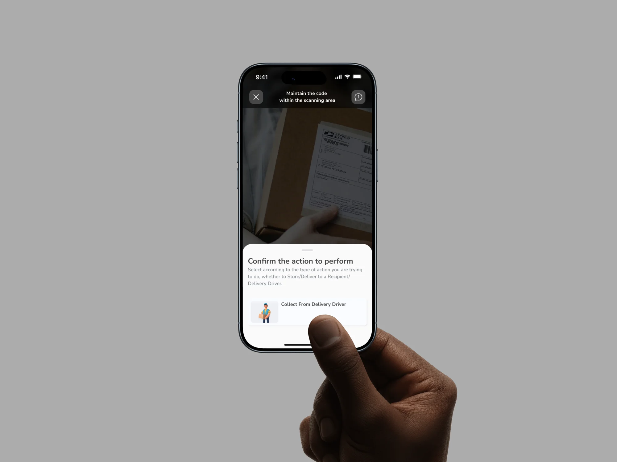
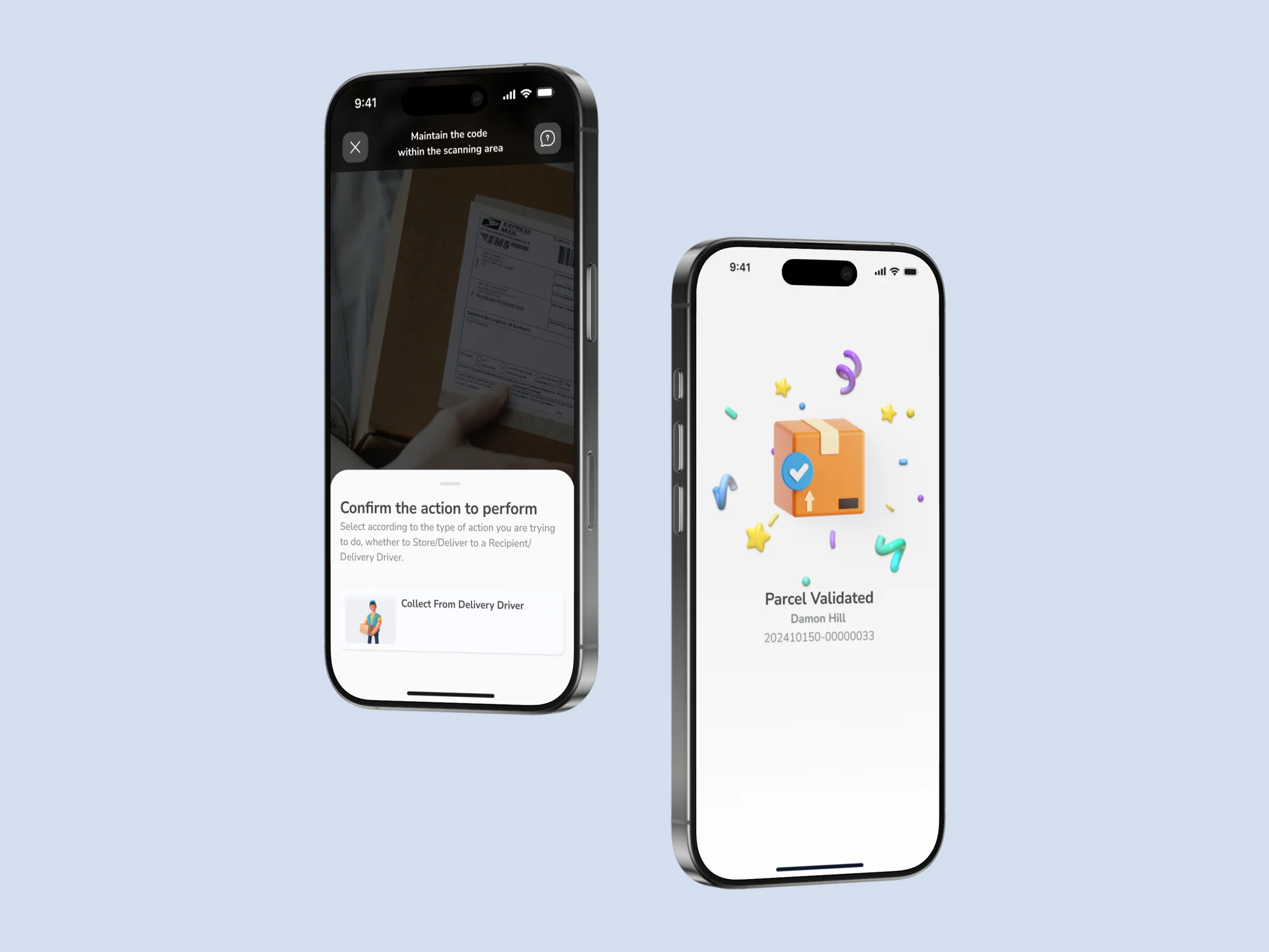
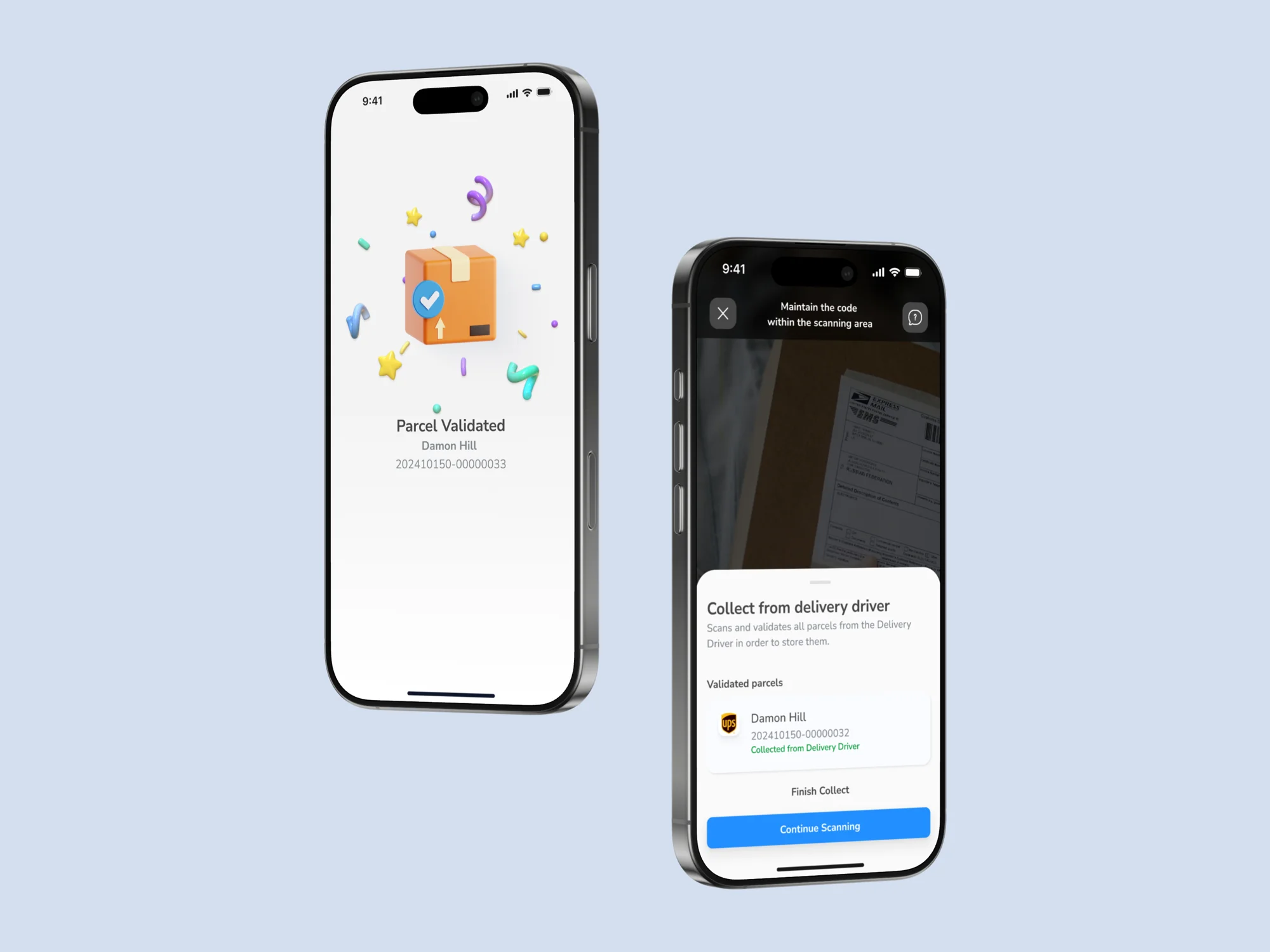
Scan first, decide after
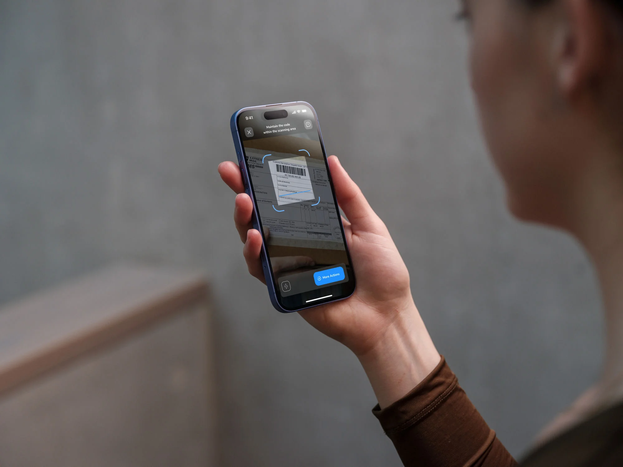
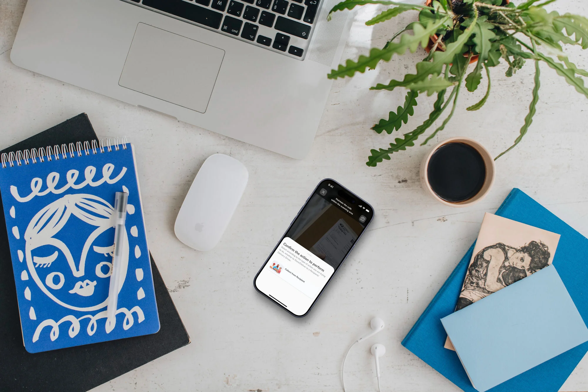
The previous version forced the kounter to decide the transaction type before scanning. The problem: they often didn't know. I inverted the logic. You scan first. Then the app shows a confirmation with the possible options in that context: are you receiving this package from the courier or handing it to the customer? A clear question, with illustrations of each person, not abstract icons.
The kounter no longer needs to understand logistics to use the app. They only need to know who's in front of them.
One screen, all complexity absorbed
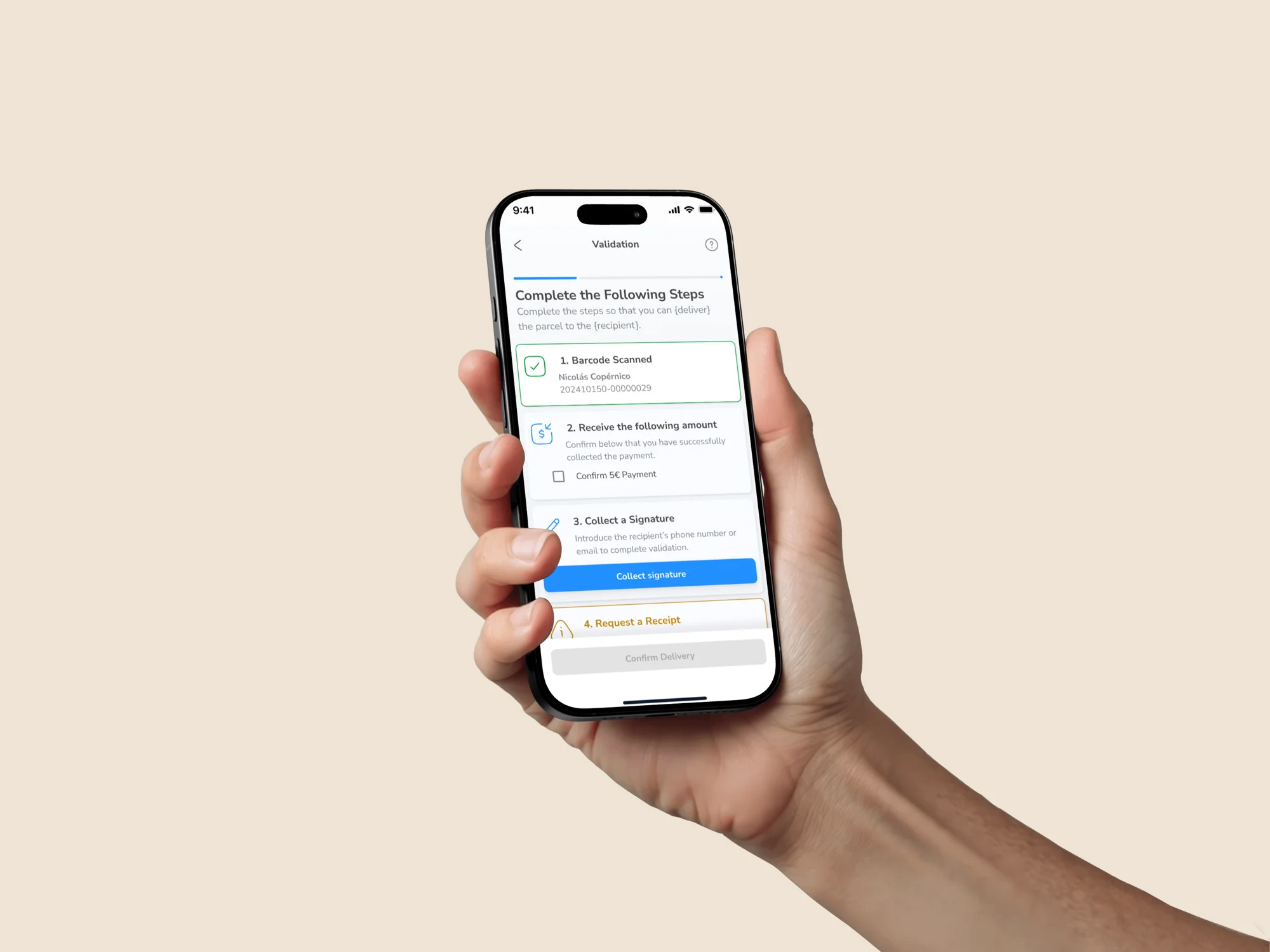
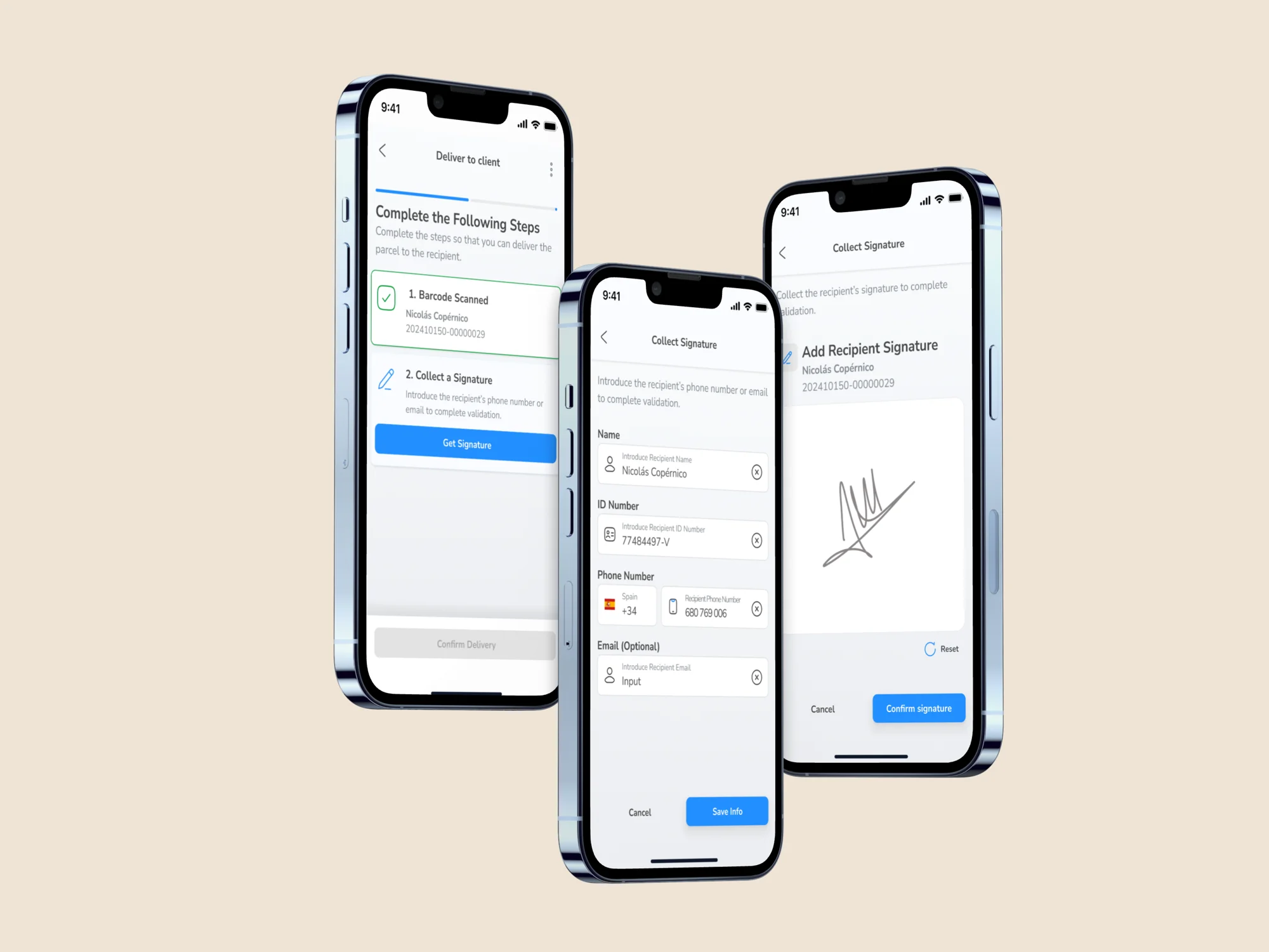
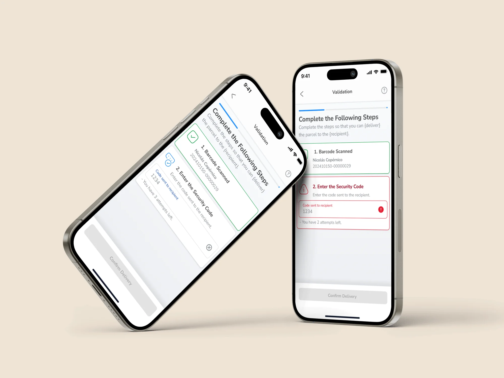
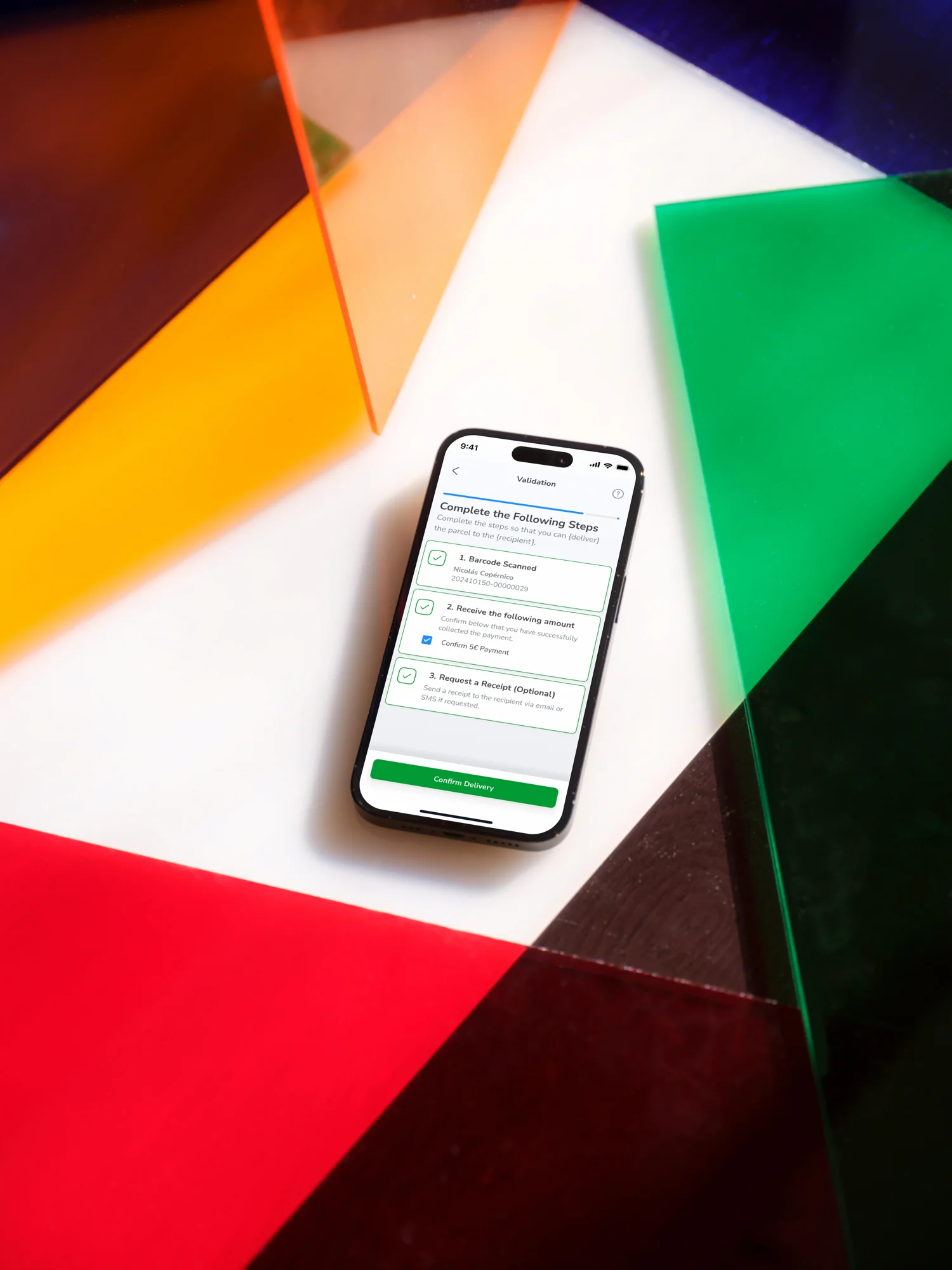
Each carrier requires different steps when delivering a package: signature, PIN, cash payment, customs documentation. Managing four carriers with different requirements could have meant four different validation flows. I designed a single validation screen with conditional widgets that appear or disappear based on what that specific package needs. The kounter always sees the same structure: a numbered list of steps.
For the kounter, it's always the same experience. The system's complexity is absorbed by the design.
The system that aligned design and development from day one
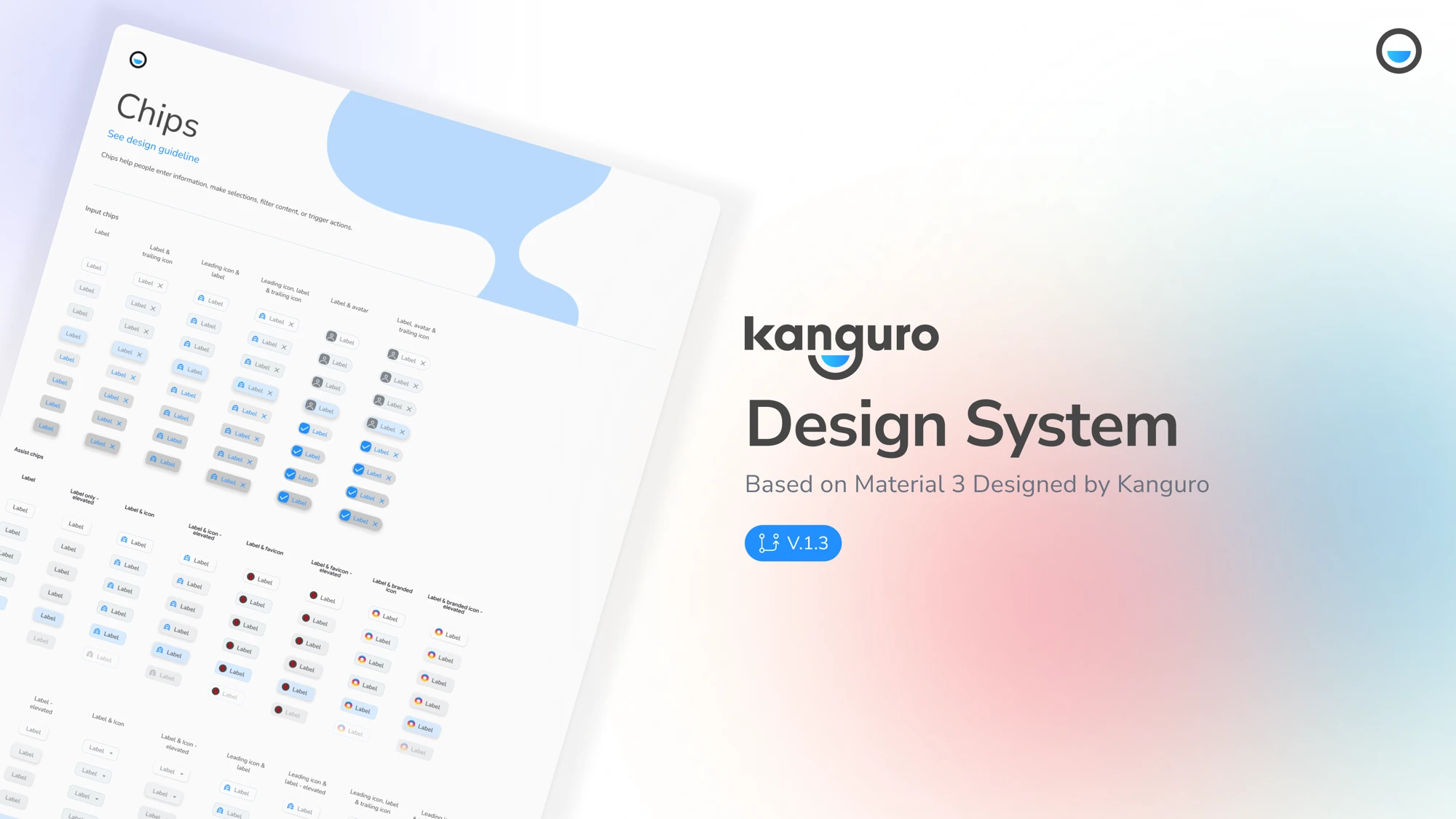
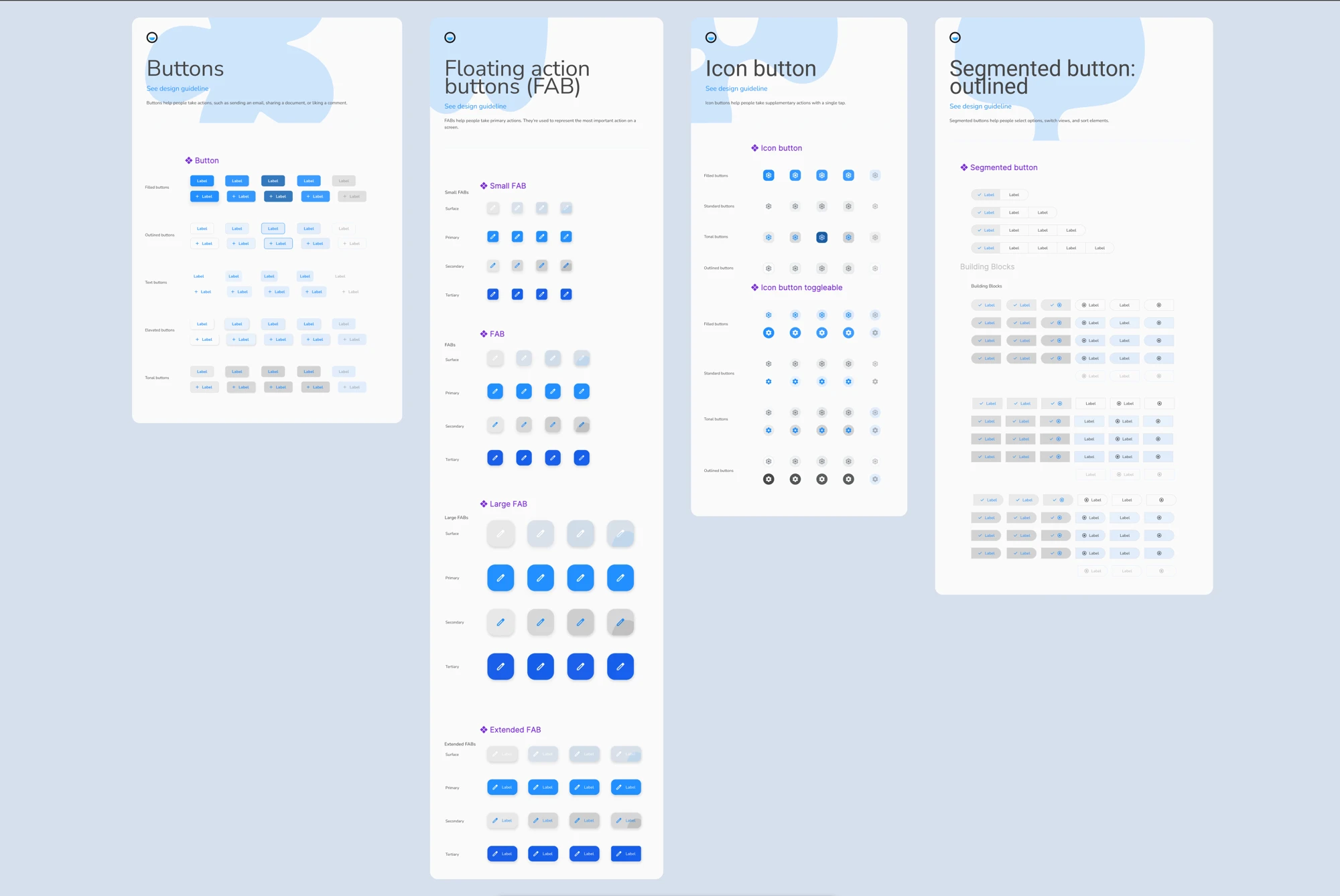
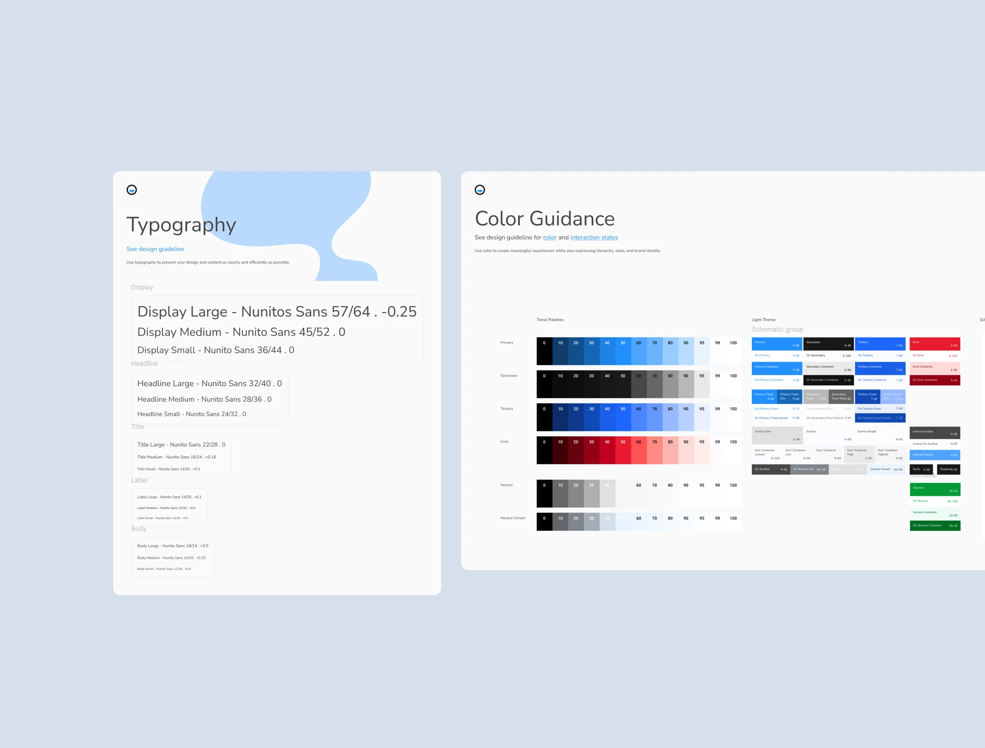
The developers used React Native Paper, a Material Design implementation for React Native. The previous version ignored that system and produced an inconsistent UI that devs constantly had to work around. I built the new design system on Material 3: it aligned design and development, reduced technical debt from day one, and gave me accessible, consistent components without building everything from scratch.
It wasn't the obvious choice. It was the right one: elevating the system devs already used into a design decision.
Outcome
Real infrastructure, not a side project
The first version reached production in 3 months. Today, the Counter App is active in over 2,700 Kanguro Points in Spain, Portugal and Germany, with around 2,900 monthly active users and a 99.9% crash-free rate on Android and 99.3% on iOS.
These aren't side project metrics. This is real production infrastructure used daily by people who didn't choose to be logistics operators — and who now execute that role with fluency.
This project taught me that designing for users with low tech literacy doesn't mean simplifying to the point of emptying: it means understanding which information is essential and which is noise, and making clear decisions about that difference. I also learned to move without a safety net — I was the only product profile throughout the entire process, without a PM or another designer, and had to defend the space for research in an environment where everything was moving fast. That week of visits and interviews was a luxury I had to justify. And it changed the product.
Live in production.
+2,700 points. International expansion underway.