Adoopta — Pet adoption app
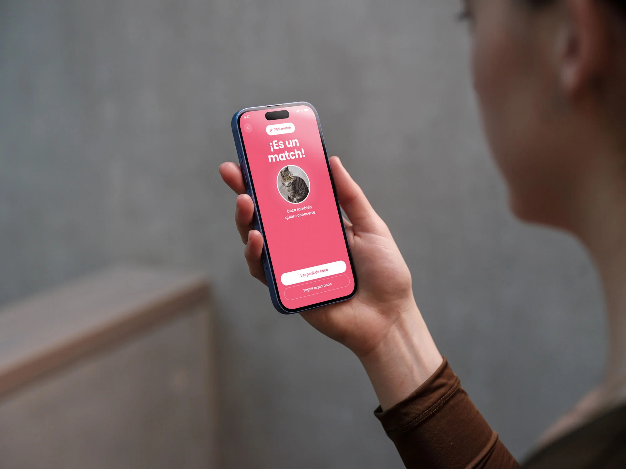
Designing a pet adoption app that connects shelters and adopters through a lifestyle compatibility quiz.


Source: Fundación Affinity, Estudio El Nunca Lo Haría 2024
Challenge
Two audiences with opposing needs
Animal shelters needed visibility and tools to manage adoption requests. Potential adopters wanted personalised guidance to make the right decision. No app on the market connected both in a coherent way.
43% of respondents didn't feel informed about the costs and responsibilities of owning a pet. Many wanted to help but couldn't adopt.
Research
Mixed-method research with two distinct audiences
I ran quantitative and qualitative research in parallel with separate scripts per profile. The key was not mixing the sessions — each audience had its own priorities and language.
Potential adopters
36 surveys · 6 interviews
Main need: personalised guidance
Animal shelters
45 surveys · 5 interviews
Main need: visibility and management
Solution
A quiz that makes real matches without losing the user
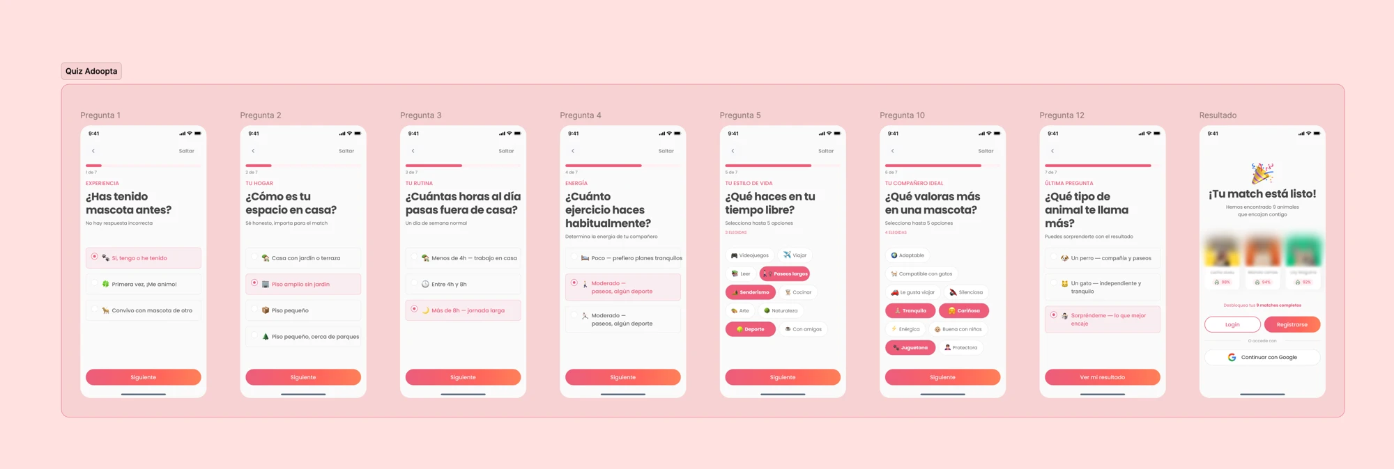
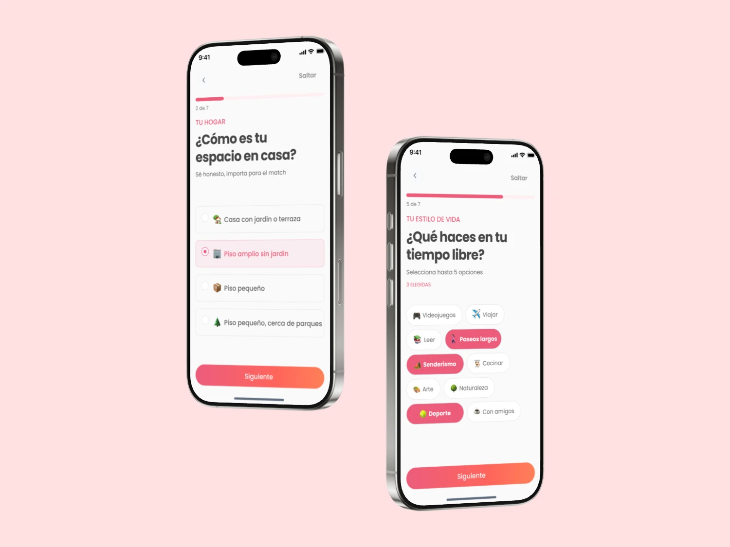
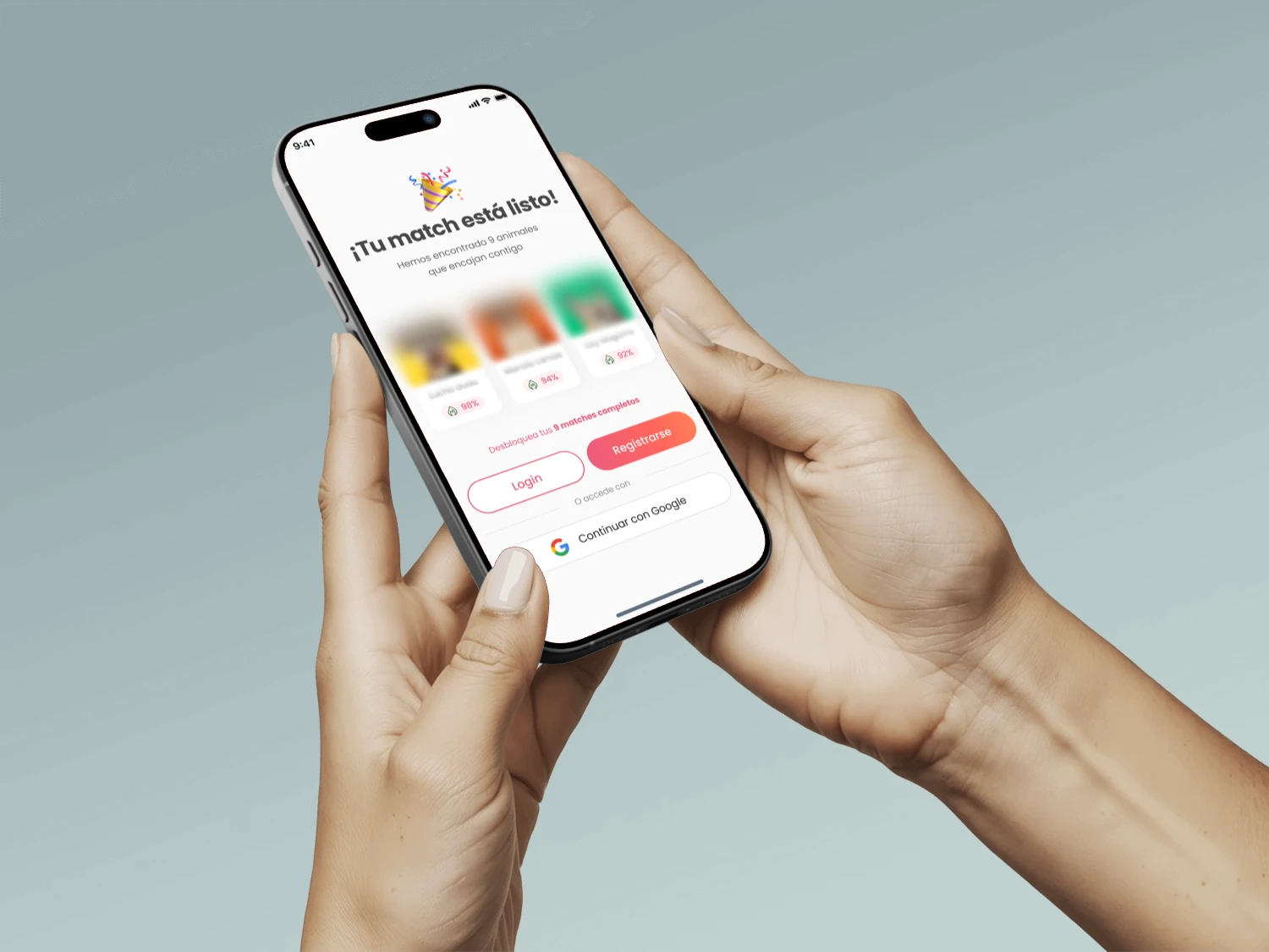
The compatibility quiz was the most complex design challenge. It had to be precise enough to make real matches, but not exhausting. I started with 10 questions based on lifestyle, living space, and personality.
Usability tests revealed a high drop-off rate. I reduced to 7 questions and the flow was completed without friction.
From match to adoption: a frictionless flow
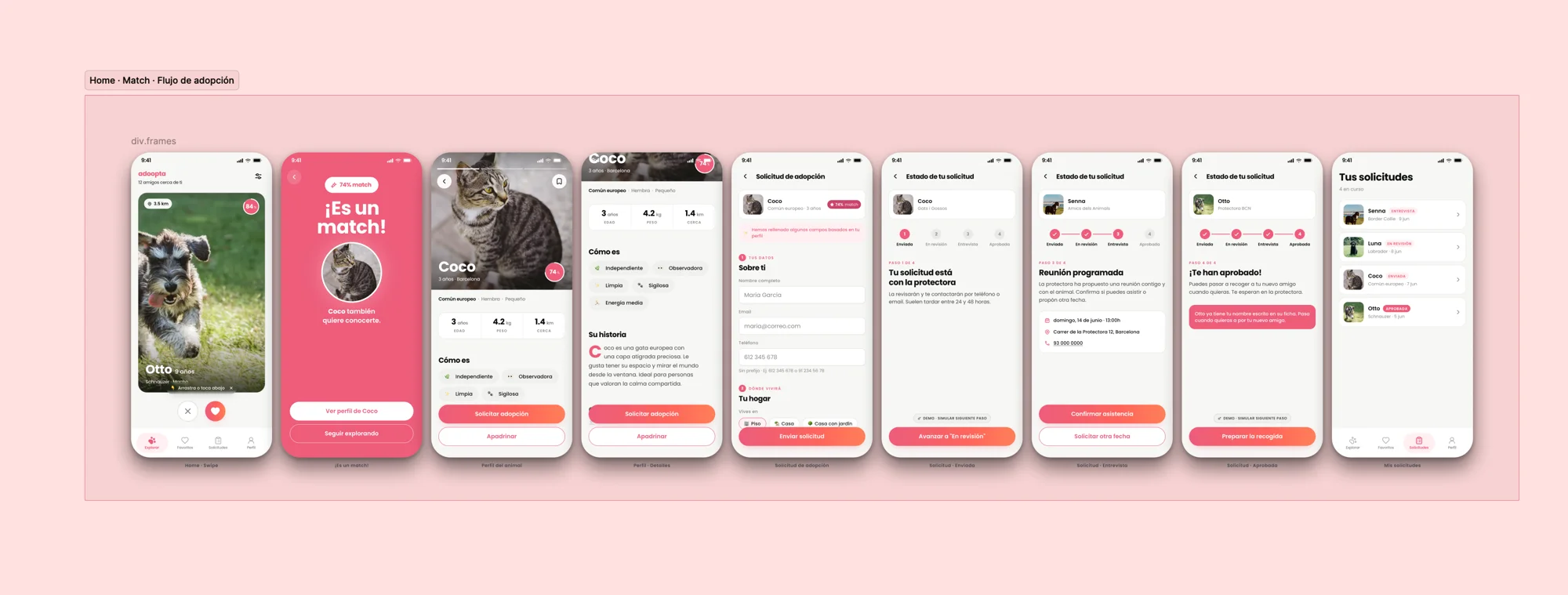
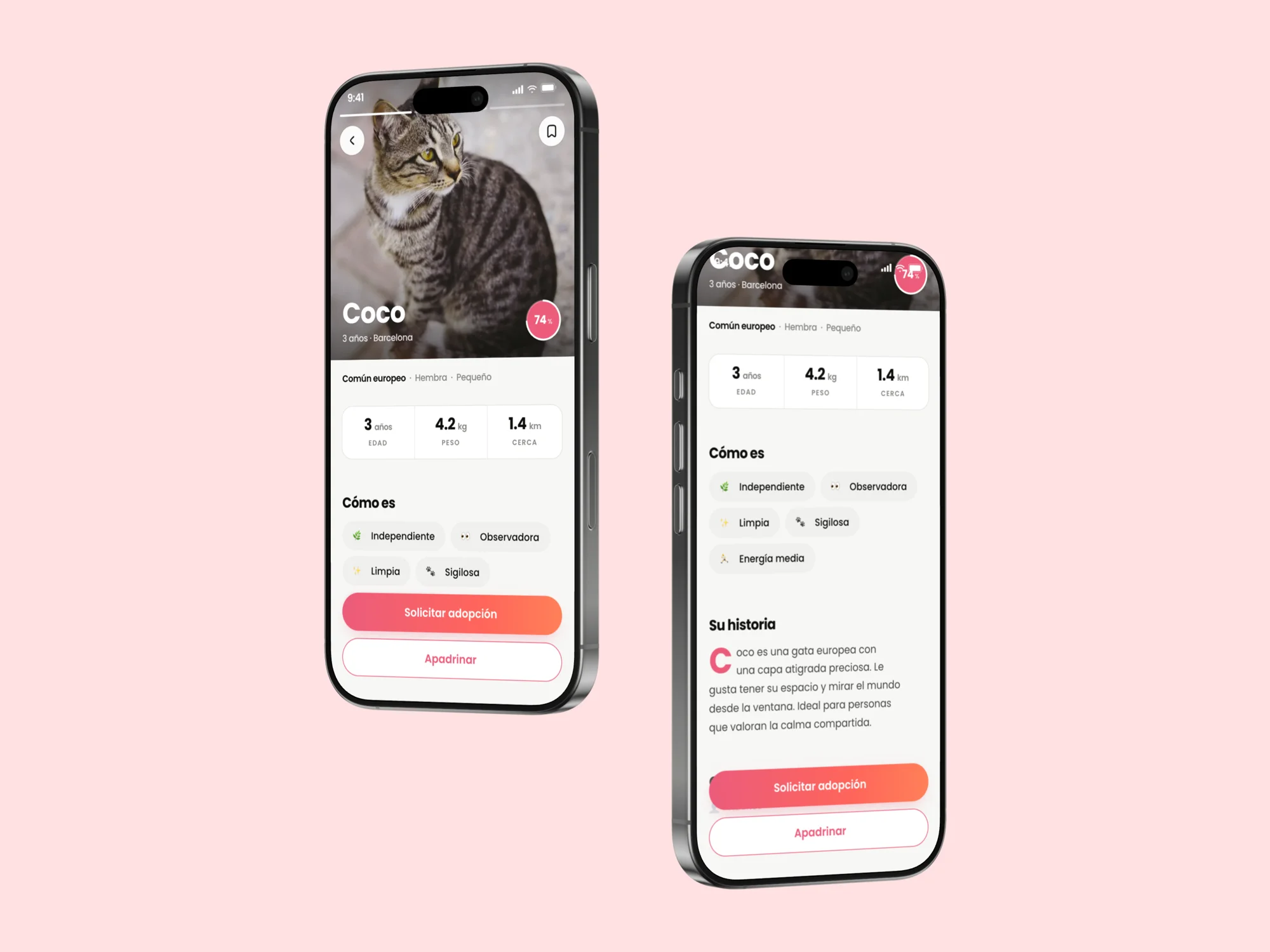
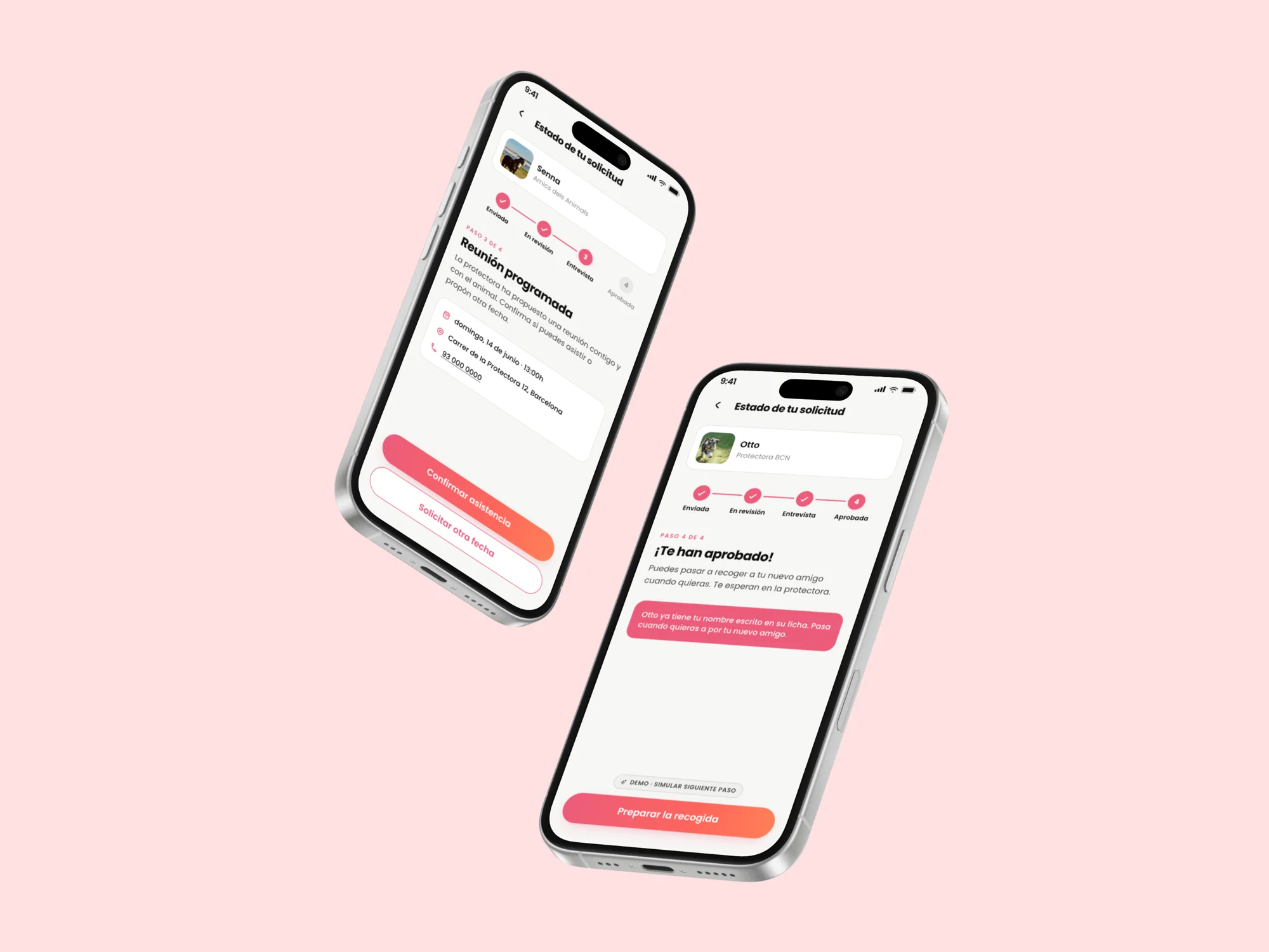
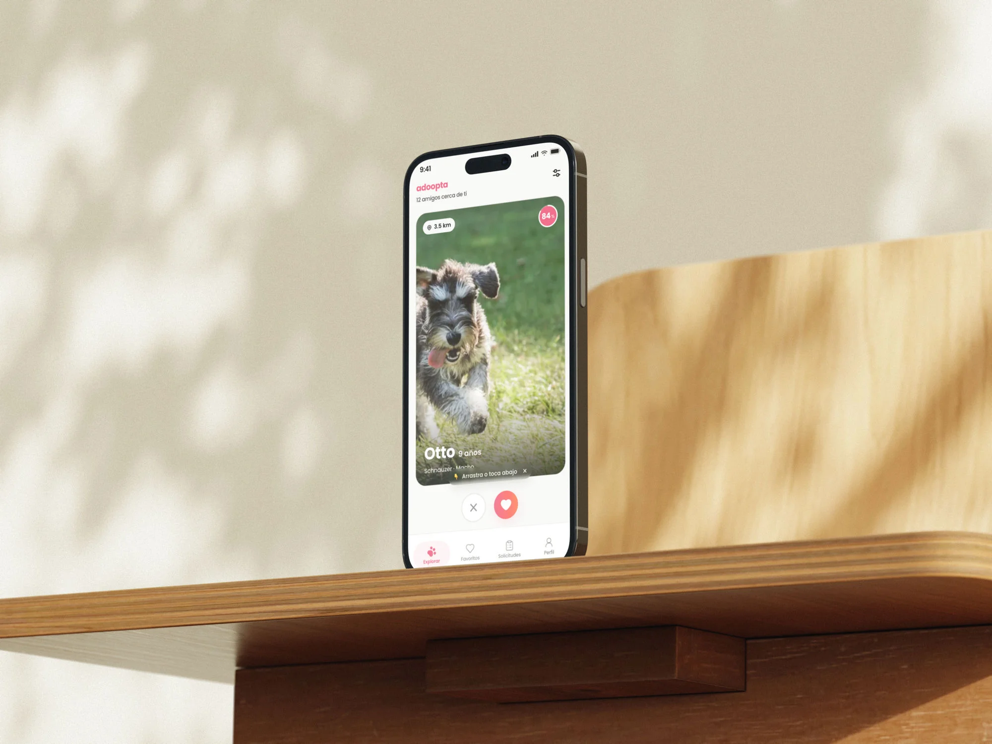
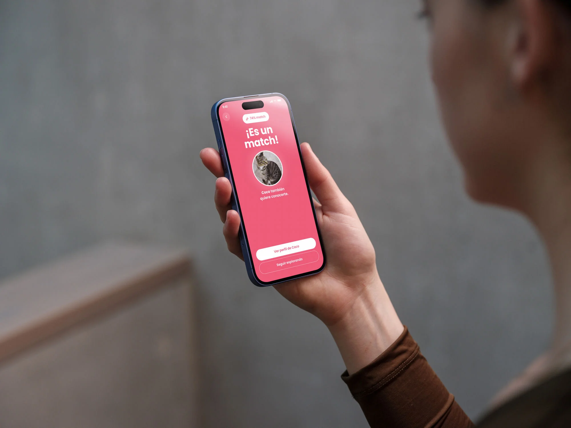
With the quiz solved, the next challenge was designing the complete high-fidelity flow: from the match screen to adoption confirmation. Eight screens that had to feel natural to someone who had never adopted before.
Showing the request status at every step was the most valued change in testing: adopters needed to know exactly where they were in the process.
For those who want to help without adopting
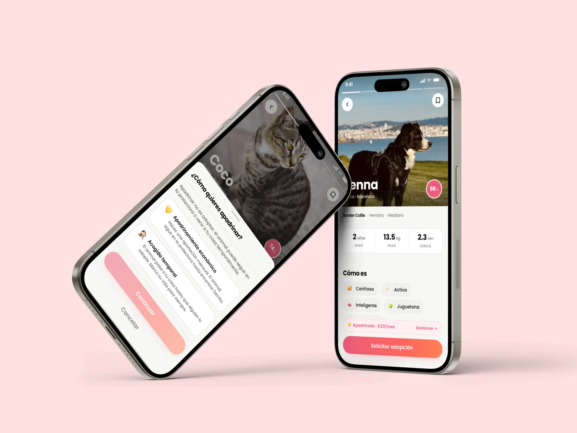
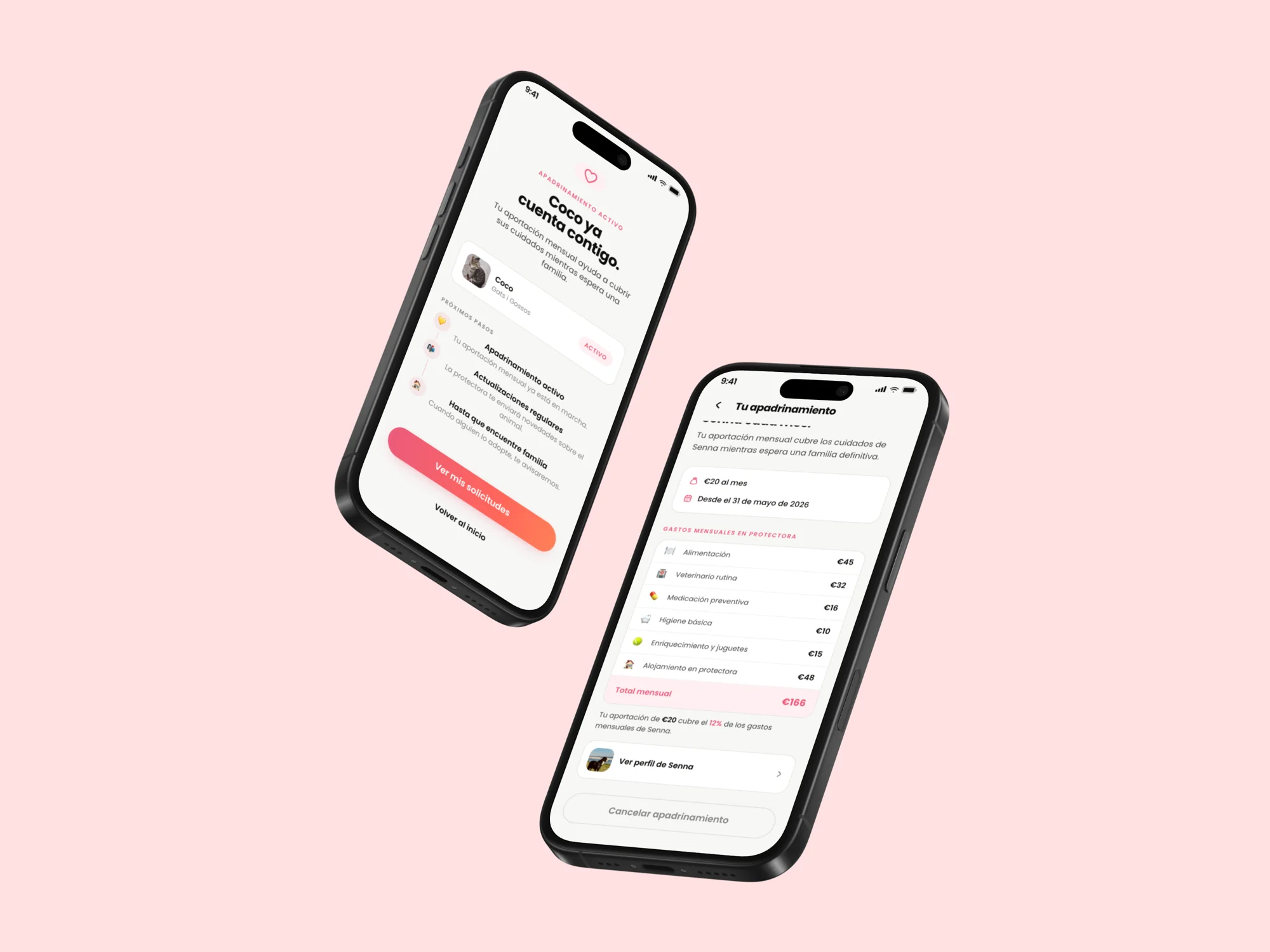
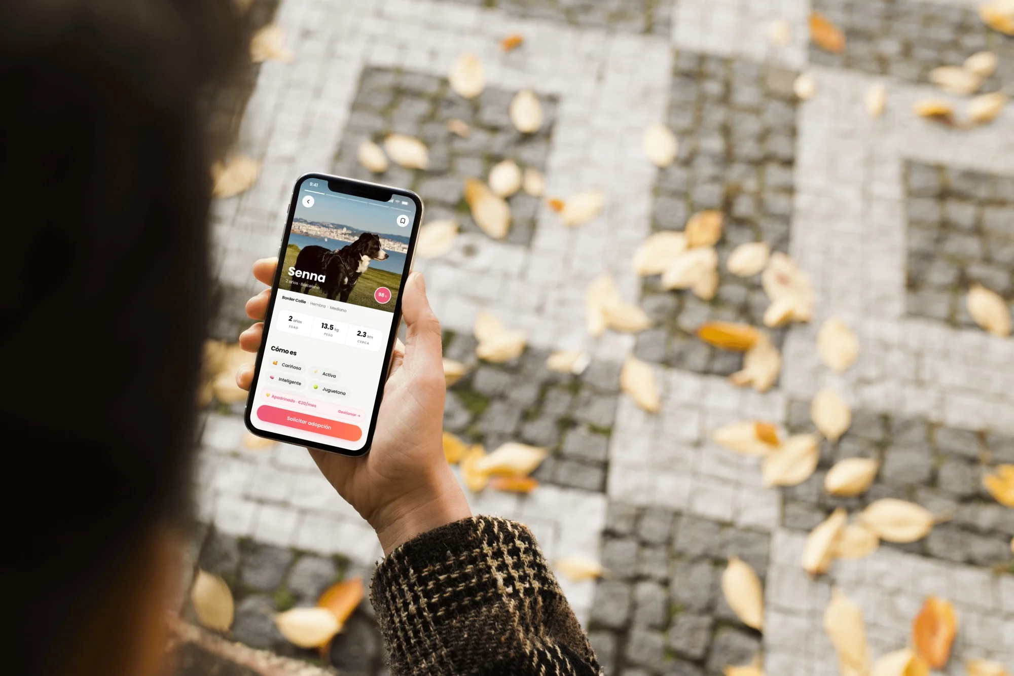
The sponsorship feature came directly from research: many people wanted to contribute financially while the animal waits for a family. I designed two modalities — economic sponsorship and temporary fostering — with a clear flow that shows exactly how every euro donated is spent.
"A brilliant alternative for those who want to help without being able to adopt"
— Usability test participant
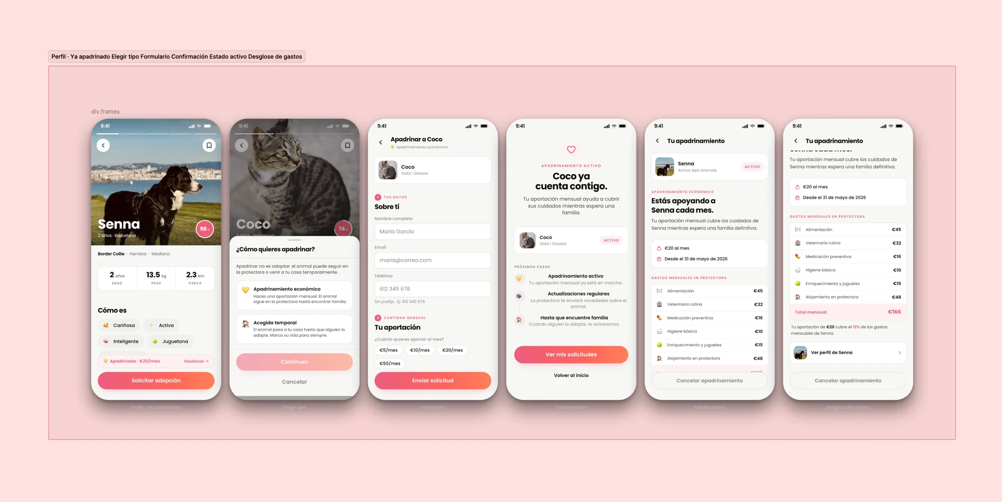
The monthly expense breakdown was the most valued decision in testing: seeing that €20 covers 12% of Senna's real costs built more trust than any motivational copy.
Testing
10 users, 3 profiles, one key iteration
Usability tests with 10 participants: first-time adopters, volunteers, and shelter staff. The match system was validated as "useful and empathetic". The donation flow needed a copy and visual hierarchy revision to reduce friction.
Main iteration: simplified onboarding and redesigned shelter contact CTAs.
Outcome
A system, not a screen
The final version included low and mid-fidelity wireframes, a hi-fi prototype in Figma, and a basic design system with key components. The final presentation received positive feedback for the depth of research and consistency between insights and design decisions.
Adoopta demonstrates that a well-designed adoption flow can bridge the gap between shelters and adopters — and that sponsorship can become a sustainable funding source for shelters.
Adoopta was my first end-to-end project with real research. I learned that designing for two audiences with opposing needs requires systems, not screens. The compatibility quiz was the hardest solution to validate — and the one that had the most impact in user testing.
Project complete.
You can try it right now.